🎨 2 Colors Is All You Need - Simple = Stunning Color Combos
- LaLa

- May 12
- 2 min read

Why limited color palettes actually work better
You don’t need 12 colors to make a good painting.Most of the time, they’re the reason it falls apart.
Using just two colors forces everything to work together—whether you planned it or not.
🎯 Everything Automatically Harmonizes
When you mix from only two colors, every variation is connected.
There’s no random color jumping out.No weird disconnect between sky, ground, and subject.
It all belongs—because it literally came from the same place.
🎯 You Stop Overthinking
Too many choices slow you down.
With two colors, there’s nothing to debate:
darker or lighter
more water or less
lean warm or cool
That’s it.
You spend less time deciding and more time actually painting.
🎯 Your Values Get Better
When color options are limited, you start relying on:
light vs dark
soft vs sharp
edges and flow
That’s where strong paintings actually come from—not from having the “perfect” color.
🎯 Mixing Becomes Interesting (Not Muddy)
Here’s the part people get wrong.
More colors = more chance of mudFewer colors = controlled variation
With two colors, you can push:
one dominant (mother color feel)
subtle neutrals
clean blends
And it stays cohesive instead of chaotic.
🎯 It Forces Better Decisions
You can’t hide behind color.
If the painting works, it’s because:
composition works
values work
water control works
Not because you grabbed a prettier tube.
🖌️ Try These Color Combos
Pick any two colors and don’t overthink it. Experiment with different color combos.
Some solid pairs:
Ultramarine + Burnt Sienna
Indigo + Warm Sand
Coral + Moss Green
Lavender + Olive
Unexpected Genius
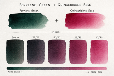
1. Perylene Green + Quinacridone Rose
Deep, moody, almost black-greens against glowing pink
Feels dramatic, slightly eerie, really atmospheric

2. Cobalt Teal + Burnt Sienna
Bright, almost artificial teal vs earthy warmth
That clash = instant energy without looking chaotic

3. Dioxazine Purple + Hansa Yellow Light
Intense dark vs sharp light
Pushes high contrast fast, great for bold pieces

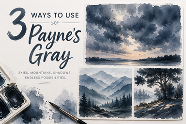
4. Payne’s Gray + Naples Yellow
Muted, soft, almost vintage palette
Super subtle, but really elegant when handled loosely
Make one painting. Don’t switch colors halfway through.
Let it do what it does.

🔚 Final Thought
More color feels like more control. It’s usually the opposite.
Two colors is where things start to click.