10 Unexpected Spring Color Combinations for Artists to Inspire Your Palette
- LaLa

- Mar 24
- 3 min read
Spring invites artists to refresh their palettes with colors that evoke new life and creativity. While classic spring hues like pastel pinks and fresh greens are popular, exploring unexpected color combinations can spark fresh ideas and unique artworks. This post highlights ten surprising spring color pairs that work beautifully for artists, including three carefully selected combinations: coral with moss green, lavender with olive, and teal with soft peach. These blends go beyond typical home decor trends and focus on inspiring artistic expression.

Coral and moss green create a lively yet grounded contrast on an artist’s palette.
Spring (or any season!) Color Combinations

Coral and Moss Green
Coral’s warm, vibrant energy pairs surprisingly well with the earthy, muted tone of moss green. This combination balances brightness with calmness, making it ideal for nature-inspired paintings or abstract works that want to convey both vitality and stability.
Use coral for focal points or highlights to draw attention.
Apply moss green as a grounding background or shadow color.
This pairing works well in floral compositions or landscapes with a twist.

Lavender and Olive
Lavender’s soft, cool purple hue contrasts with olive’s deep, yellow-green undertone. Together, they create a sophisticated and slightly unexpected harmony that can add depth to portraits or still life paintings.
Lavender can be used for delicate details or atmospheric effects.
Olive provides a natural, organic base that complements lavender’s softness.
This duo suits moody, introspective artworks or spring scenes with a vintage feel.
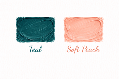
Teal and Soft Peach
Teal’s rich blue-green tone combined with soft peach’s gentle warmth offers a fresh and modern palette. This combination feels both calming and uplifting, perfect for abstract art or contemporary figurative pieces.
Teal can dominate backgrounds or large shapes.
Soft peach adds warmth and light, ideal for skin tones or highlights.
Use this pair to create contrast without harshness.

Mustard Yellow and Dusty Blue
Mustard yellow brings a bold, warm punch, while dusty blue cools it down with a muted, soft tone. This pairing is excellent for artists seeking a vintage or retro vibe in their spring-themed work.
Mustard yellow energizes compositions.
Dusty blue balances with subtlety.
Great for urban scenes or stylized portraits.

Blush Pink and Charcoal Gray
Blush pink’s gentle warmth contrasts with charcoal gray’s deep neutrality. This combination is perfect for artists wanting to evoke softness with a touch of drama.
Use blush pink for highlights or delicate elements.
Charcoal gray anchors the piece and adds sophistication.
Ideal for figurative art or minimalist abstracts.

Mint Green and Coral Red
Mint green’s cool freshness pairs dynamically with coral red’s vivid warmth. This combo is playful and eye-catching, suitable for lively compositions or botanical illustrations.
Mint green can serve as a fresh background.
Coral red works well for focal points or accents.
Use to convey energy and renewal.

Indigo and Warm Sand
Indigo’s deep, cool blue contrasts with warm sand’s light, earthy tone. This pairing offers a grounded yet mysterious palette for artists exploring natural themes or abstract landscapes.
Indigo adds depth and intensity.
Warm sand provides softness and balance.
Great for moody skies or textured backgrounds.

Chartreuse and Soft Lilac
Chartreuse’s bright yellow-green vibrancy contrasts with soft lilac’s pale purple calmness. This unexpected duo can create energetic yet gentle compositions.
Chartreuse grabs attention and adds brightness.
Soft lilac soothes and balances.
Use in floral or fantasy-inspired artworks.

Burnt Orange and Slate Blue
Burnt orange’s rich, warm hue pairs well with slate blue’s cool, muted tone. This combination feels earthy and sophisticated, perfect for autumnal spring themes or dynamic abstracts.
Burnt orange energizes and warms.
Slate blue cools and grounds.
Use for dramatic contrasts and layered textures.

Pale Gold and Forest Green
Pale gold’s subtle shimmer contrasts beautifully with forest green’s deep natural tone. This pairing evokes elegance and freshness, ideal for botanical art or refined still life.
Pale gold highlights and adds light.
Forest green provides depth and richness.
Use to create a luxurious yet organic feel.