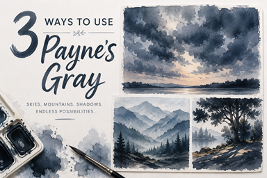
How to Create a Moody Oil Painting Using Gray-Toned Colors


There’s something incredibly satisfying about creating a painting that relies more on value than bright color. A gray-toned palette forces you to focus on light, atmosphere, and composition instead of being distracted by vibrant pigments. The result is often a painting that feels peaceful, dramatic, and timeless.
Today I'm using a selection of muted oil colors that all lean toward gray. Even though there are hints of red, green, blue, violet, and yellow, every color is subdued, making it easy to create harmony across the entire painting.
🔘Why Paint With a Gray Palette?
Working with muted colors has several advantages:
Creates instant color harmony.
Makes it easier to judge values.
Produces a calm, sophisticated mood.
Helps develop stronger composition skills.
Prevents overly saturated paintings.
Many classic landscape painters relied on restrained palettes because atmosphere often comes from subtle shifts in temperature rather than bright color.
🏢Building the Painting

Rather than chasing detail, begin by establishing the largest shapes.
Start with:
The sky
Large land masses
Water or foreground
Dark accents
Once those are in place, gradually introduce smaller details while preserving the soft transitions that make muted paintings feel atmospheric.
🔆Where These Colors Shine

Gray-toned palettes are perfect for:
Misty lakes
Foggy forests
Rocky coastlines
Winter landscapes
Quiet marshes
Stormy skies
Evening scenes
Snow-covered fields
Because the colors are naturally desaturated, they create depth almost effortlessly.
💡Tips for Success
Save your lightest values for the focal point.
Avoid using every color equally.
Let warm grays and cool grays play against one another.
Keep edges soft in the distance.
Add your darkest darks near the end.
A few carefully placed accents will have much more impact than covering the canvas with contrast.
💭Final Thoughts
Painting with a muted palette is a great reminder that beautiful artwork doesn't require intense color. Light, value, texture, and atmosphere often tell a much stronger story than saturation alone.
If you've never tried limiting yourself to gray-toned colors, give it a try. You may be surprised how much mood and depth you can create with a palette that whispers instead of shouts.