The Weirdest Color Combinations That Actually Work
- LaLa

- May 19
- 3 min read

Some color combinations just sound wrong.
Like they should fight each other. Clash. Turn instantly muddy. Create something that belongs in a 1970s basement.
And honestly? Sometimes they do.
But sometimes the “wrong” combinations create the most atmospheric, unexpected, unforgettable paintings.
The safe palettes are easy. Blue and orange. Purple and yellow. Warm earth tones. We already know they work.
The weird combinations are where things get interesting.
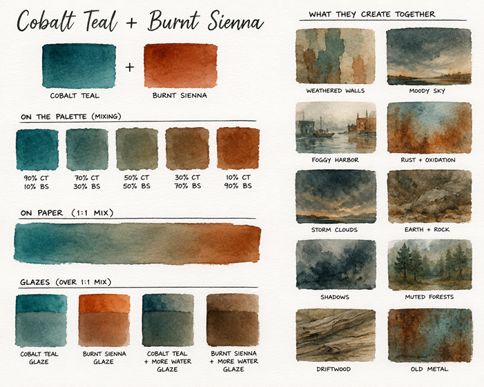
Cobalt Teal + Burnt Sienna
This combination feels illegal until you try it.
One color is cool, artificial, watery, almost tropical. The other is warm, earthy, rusty, natural.
Together? Foggy harbors. Stormy skies. Old walls. Oxidized metal. Weathered landscapes.
It creates this strange balance between vibrant and muted at the same time.
Not dead. Not screaming.
Just moody.

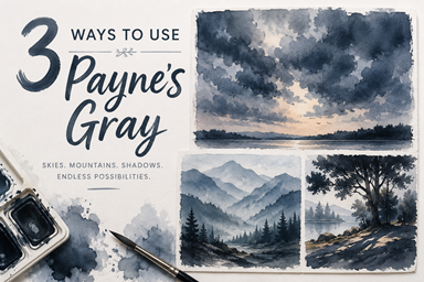
Payne’s Gray + Naples Yellow
This one feels like old paper, candlelight, and rainy mornings.
Payne’s Gray can easily overpower a painting, but Naples Yellow softens it into something atmospheric instead of harsh.
The mixes create:
dusty greens
smoky neutrals
muted olive tones
soft storm colors
It’s incredibly hard to make this combo look obnoxious.
Which honestly makes it kind of addictive.

Dioxazine Purple + Hansa Yellow Light
This combination has absolutely no business working as well as it does.
It swings wildly between:
glowing golds
murky neutrals
deep earthy browns
strange shadow colors
The contrast between the cool purple and sharp yellow creates tension in a painting — and tension is often what makes art feel alive.
Pretty isn’t always interesting.
This combo is interesting.

Perylene Green + Quinacridone Rose
This one feels cinematic.
The dark green creates almost-black shadow shapes while Quinacridone Rose injects warmth and light into the mix.
Together they create:
smoky violets
moody browns
rich dark neutrals
dramatic floral tones
It can feel floral, gothic, vintage, or even stormy depending on how much water you use.
Which is exactly why I love weird palettes.
They don’t lock you into one mood.
Why Weird Palettes Work
Unexpected color combinations force you to stop painting symbolically.
You stop thinking:
“sky = blue”
“grass = green”
“tree = brown”
And you start reacting to mood instead.
That’s usually when paintings start feeling more atmospheric, expressive, and personal.
Weird palettes also help unify paintings naturally because you’re working within a limited color world instead of throwing twenty unrelated colors at the page.
The result often feels more intentional — even when the process isn’t.
Other Color Combinations
Indigo + Raw Sienna
Olive Green + Lavender
Sepia + Phthalo Turquoise
Lunar Black + Quinacridone Gold
Payne’s Gray + Opera Pink
Cobalt Violet + Yellow Ochre
Perylene Maroon + Cobalt Teal
Hooker’s Green + Permanent Rose
Neutral Tint + Naples Yellow
Ultramarine Violet + Buff Titanium
Sap Green + Coral
Daniel Smith Moonglow + Transparent Orange
Burgundy + Olive Green
Cerulean Blue + Burnt Umber
Shadow Violet + Nickel Azo Yellow
Phthalo Green + Indian Red
Davy’s Gray + Quinacridone Burnt Orange
Undersea Green + Lavender
Turquoise + Venetian Red
Indigo + Peach Beige
Final Thoughts
Some of the best paintings happen when colors almost shouldn’t work together.
That little bit of tension creates surprise.
And surprise is what keeps paintings from feeling generic.
Try the weird color combinations.
Worst case? You make mud.
Best case? You discover a palette you never would’ve chosen on purpose.